Behind the Design with Brian Gundell: Creating the Winterhawks' New Look
Published on August 26, 2022 under Western Hockey League (WHL)
Portland Winterhawks News Release
On Wednesday, Aug. 24, the Portland Winterhawks unveiled a new set of primary uniforms for the first time since the team moved to the Rose City, finalizing a two-year rebranding process with a new, unique on-ice identity.
It was a moment over a year in the making - as the team adopted a brand new set of logos during the summer of 2021, jersey designs were already in the works with hopes of launching for the upcoming 2022-23 campaign.
The rebrand was a collaborative process from start to finish, but the man at the center of it all was designer Brian Gundell. A PNW native, Gundell specializes in sports branding and identity development for professional and amateur teams throughout North America. Gundell's work includes projects with MLB, NFL, MLS and NHL teams, as well as major brands like adidas, Under Armour and more. Cementing his PNW hockey pedigree, Gundell created the secondary logo for the Seattle Kraken and was a prominent designer of their inaugural uniform set.
Despite his vast array of impressive clientele, Gundell says the Winterhawks' rebrand was one that really hit close to home.
"This project is definitely something that is near and dear to my heart, as somebody who called Portland home off-and-on for 20 years," said Gundell, "I've been to a lot of Winterhawks games, so to be able to get the opportunity in the first place to work on the rebrand, to work on the uniforms and do some graphics around the arena itself has been so cool for me. And then to see it all come to life has been really special."
It's been a long time coming for Gundell and the team; after the successful launch of the new logos on July 14, 2021, the internal countdown has been on to the announcement of the new uniforms.
"I've been so excited for this moment, I've been on pins and needles waiting for it from the initial design that we did a year ago to seeing the photos of the first samples of the jersey. So excited that it's finally here and out and it's exciting that - can I say this? - there's more to come! I can't wait for it to all be out there. I think fans, once they see everything, are going to be blown away," said Gundell.
And while we wait for the "more to come," there's plenty to digest with two all-new looks for the team this season.
The work that went into the rebrand was two-fold, with initial attention paid to the logo soon given to a unique look for players to wear on the ice and fans to be proud of in the stands. And though the announcements were made a year apart, the logo and uniforms were always meant to go hand-in-hand. As new colors like squall gray and celly gold were added into the traditional red, black and white of the Winterhawks color palette, it was important that everything came across as one cohesive brand - a modern design that somewhat departed from the norms of the hockey world.
"We wanted to make sure the design felt sleek to match the new logo, that was really important. So that's why we went with a modern design, in addition to the fact just in my own personal taste, I'm much more interested in the anti-traditional...maybe that's just me being a University of Oregon alum, but I really like the new Minnesota Wild jerseys, the Arizona Coyotes jerseys prior to the Kachina revamp, old 90's (Philadelphia) Flyers uniforms, the Vegas Golden Knights uniforms...all of those, they feel like the next wave of traditional hockey designs. And maybe we are going with a little bit of a zeitgeist, but I feel like this design matches with the logo really well. And that is what we set out to do, to mesh the uniform with the look of the logo and have everything feel synergistic," said Gundell.
That meshing process was relatively painless, with Gundell and Winterhawks management largely on the same page regarding design direction. From there, it was just about getting the colors right on the finished product.
"Overall, from initial design to completion, it's about a year-long process - including sampling and manufacturing at CCM - and that's why we weren't able to do this last year, because it takes that long. It's worthwhile because there was a lot of back-and-forth, especially with physical samples, with making sure that we were getting dye colors right on the fabric, making sure we were getting dye colors right on the twill for the numbers - there was a lot of testing that went into making the uniforms complete. But from design to production files, it was a fairly smooth process...maybe like six weeks? The great thing was that we got a lot of buy-in early on and it was just 'hey what does it look like if we tweak this color or this detail'...there were a lot of different factors, but a lot of it was just tweaking rather than major design overhauls," said Gundell.
And so the new identity of the Portland Winterhawks was born, with a greater emphasis on wintery shades like black, white and gray and scaled-back tones of red. Perhaps the greatest departure in the look of the Hawks' uniform is the striking red sweater as the primary look we've become accustomed to, but as Gundell and Winterhawks management evaluated the look of the new logo on different backgrounds, it was clear that the first dark jersey had to be black.
"Everybody really liked how the logo looked on a black background, so that's why we decided to elevate black as the primary color on the dark jersey. But red is still a signature color of the team, and it looks so good and it's what the team has worn for almost 50 years. That being said, red on black is really, really, really eye-catching. So we wanted to be a little bit restrained with it...we have some pops of red at the collar, in the sleeve, and in the sock to match, but with the integration of other colors, I wanted to make them proportional in the stripe to the amount of each color that's in the logo," said Gundell.
The team's specific shade of gray - squall gray, as it has been dubbed - represents the forefront of that unique identity. And while matching that specific shade does take a healthy dose of patience - the dye-matching process with jersey manufacturer CCM featured plenty of back-and-forth - a look at the Portland sky during hockey season quickly reveals the inspiration for the new hue.
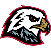
"We were playing around with colors in the early development of the logo design, and I knew early on conceptually that I wanted to put Mt. Hood into the hawk head. But I didn't want the mountain peaks to be distracting, so I wanted to tone them back...when you go out in Portland, any time from September to May, you get those bleak, gray rainy days that we're so well-known for. I kind of thought that sky color feels very much like the rocky color underneath the snow of Mt. Hood.
"I thought it would be a really appropriate choice and something that would be unique to Portland...collectively, we decided to do a color that was completely unique in the sporting landscape. So that Pantone swatch is a bluish gray, and we kind of thought of those storms that you see out over the coast which have those bluish gray tones to them, feeling 'wintery' in that regard. That was a really cool feature of the brand, and when we were working on the uniform design, we wanted to play that color up because it is completely custom and unique to the Winterhawks and it is something they can own all across sport," said Gundell.
"Having the inline is pretty uncommon...we had the custom font on the jerseys last year, which was great, but this is like taking that up a notch. I think this year, having the outlines of the name and number be squall gray, having the inline be the back number really takes these to the next level. And that's something that I was really looking forward to doing because it matches our wordmark and really feels much more unique and special as part of the brand," he said.
As with any rebrand, the significant changes can be jarring. But in the end, Gundell says it's all about giving the Winterhawks, and Portland, something to call their own.
"It's cool to see the team have something that is theirs, and only theirs. From the crest, to the colors, to the stripe pattern - this is Portland's. A lot of people who aren't educated in design or who don't look at hockey jerseys every day are going to look at this and go 'oh it looks like x-y-z,' but I promise it's all done originally with care and with the thought of those things in mind.
"It's a new era of Winterhawks hockey, and we can't really keep the old Blackhawks hand-me-downs while having this talk about how we're in this new era and we're doing things differently and doing it our way and NOT have the uniform be a key component of that. So it was really cool to see that come to life," he said.
With everything now out in the open, it's time to play hockey - a new season and new uniforms await this year's Winterhawks, who kick off training camp in less than a week.
"I'm hoping that this year it's the 'look good, feel good, play good' thing in the new threads...I think it's going to be so cool to see people walking around in Portland and around the country wearing Winterhawks gear that I designed. It's a special feeling and it's kind of up there at a little extra level for me because of my connection to the city and the team," said Gundell.
"It's been a pleasure to work on this. I hope everybody comes to embrace the new look, I know a lot of people are really excited about it, maybe the people that aren't convinced will come around, but at the end of the day, let's just go support the Winterhawks and watch them win the Memorial Cup."
Western Hockey League Stories from August 26, 2022
- Alumni Spotlight: Jared Spurgeon - Spokane Chiefs
- Behind the Design with Brian Gundell: Creating the Winterhawks' New Look - Portland Winterhawks
- Americans Announce 2022 Training Camp Schedule - Tri-City Americans
- Alumni Spotlight: Team Spurgeon - Spokane Chiefs
- Mateychuk at the Top of his Game Heading into 2022-23 - Moose Jaw Warriors
- Pats Announce 2022 Training Camp Schedule & Roster - Regina Pats
- Royals Announce 2022 Training Camp Schedule - Victoria Royals
- Warrior-Themed Orange Shirts Available Now for Pre-Order - Moose Jaw Warriors
The opinions expressed in this release are those of the organization issuing it, and do not necessarily reflect the thoughts or opinions of OurSports Central or its staff.
Other Recent Portland Winterhawks Stories
- Winterhawks Sign Cullen Stephenson to Scholarship and Development Agreement
- Winterhawks Sign Stevie Grumley to WHL Scholarship and Development Agreement
- Mike Johnston Continues with Hockey Canada's Program of Excellence
- Winterhawks Add Nine Players During 2026 WHL Prospects Draft
- Winterhawks Draft Cullen Stephenson 10th Overall in 2026 WHL Prospects Draft