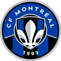
Montreal Impact Reveal New Crest Ahead Of 2012 Debut
Published on August 7, 2011 under Major League Soccer (MLS)
Club de Foot Montreal News Release
MONTREAL - The Montreal Impact unveiled their new crest at halftime of their match against the Minnesota Stars on Saturday night in front of a capacity-crowd at Saputo Stadium as the club continues preparations for its debut as an expansion team in Major League Soccer next season.
"Today we are writing a new page in our history," club president Joey Saputo said. "This logo is much more than just a logo, it's a symbol of our engagement towards every soccer fan in Quebec. This new logo is primarily our supporters' logo. I truly believe that Montreal can become the biggest soccer market in North America."
Created by design agency Pigeon, the latest version of the Impact crest conveys the club's evolution while showcasing its close relation with the city of Montreal and province of Quebec. Olivier Chevillot, creative director for Pigeon branding + design explained that the new logo conveys the club's evolution toward another level of soccer.
"This new logo is more sophisticated, modeled around renowned international clubs", explained Chevillot. "We are proud of our participation in the development of this major league symbol."
The logo features eight symbols, each representing an element of the city or the club:
Blue: The club's predominant color since its creation in 1993, while referring to the color of the provincial flag.
Four stars: Each star represents the four original communities of Montreal - the French, the English, the Irish and the Scots.
Fleur-de-lys: As promised, the fleur-de-lys has a predominant place on the logo.
Black and blue stripes: This symbol refers to first logo of the club, when it won the championship in 1994.
Scarf and team's name: The scarf and slanted name represents the team's supporters and hints back to the club's inaugural logo in 1993 as well as the one in 2002.
New motto: The team's new motto - "Tous pour gagner" - refers to the importance of unity for victory and reminds fans that the club is the sum of relentless efforts from players, staff, partners and supporters.
Shield: Formed in a traditional shape, the shield is a derivative of the city's crest.
Silver: The silver used in the logo represents the background of the city of Montreal's crest.
Next up for the club is the presentation of the official jerseys for next season, which will be unveiled in November.
Major League Soccer Stories from August 7, 2011
- Whitecaps FC Top Chicago Fire 4-2 - Vancouver Whitecaps FC
- Chicago Fire Outdueled by Vancouver Whitecaps FC 4-2 - Chicago Fire FC
- Real Salt Lake Continues Eastern Swing - Real Salt Lake
- Timbers Reserves Down Earthquakes Reserves 2-0 - Portland Timbers
- Montreal Impact Reveal New Crest Ahead Of 2012 Debut - Club de Foot Montreal
- On the Road Chivas USA Pick up Three - Club Deportivo Chivas USA
- FC Dallas Falls 3-1 to Galaxy in Los Angeles - FC Dallas
- Cooper's Goal Helps Timbers to 1-1 Draw with San Jose - Portland Timbers
- Red Bulls Overcome by Real Salt Lake, 3-0 - Red Bull New York
- Real Salt Lake Back On Track With 3-0 Win Over Red Bulls - Real Salt Lake
The opinions expressed in this release are those of the organization issuing it, and do not necessarily reflect the thoughts or opinions of OurSports Central or its staff.
Other Recent Club de Foot Montreal Stories
- Official Statement from CF Montréal Regarding the Modernization of Olympic Stadium
- CF Montréal Returns to MLS Action against Rival Toronto FC this Thursday
- CF Montréal Returns to Stade Saputo this Sunday against Vancouver FC
- CF Montréal Signs Defender Luca Petrasso to Contract Extension
- CF Montréal Resumes Play in TELUS Canadian Championship against Vancouver FC