Sporting Cascades FC reveals brand identity
Published on August 23, 2025 under United Soccer League One (USL1)
Sporting Cascades FC News Release
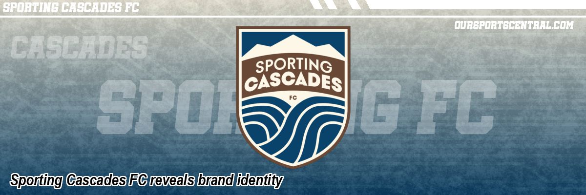
EUGENE, Ore. - USL Eugene, the organization bringing professional soccer to the southern Willamette Valley, today unveiled its oï¬Æcial brand identity as Sporting Cascades FC, which is anchored by a bold crest, a nature-driven color system and a voice rooted in the Pacific Northwest. Developed with supporters through community surveys and focus groups, the brand reflects a club built from the soil, rivers and spirit of the Cascades.
"At Sporting Cascades, we're building more than a team - we're building a movement that spans the range," said club owner Sat Dhinsa. "Our identity honors the places we call home, from Eugene to Vancouver, B.C. Just as importantly, the team name, colors and crest were shaped by this community and gave our supporters a real voice in defining who we are."
A Crest Shaped by Place
The crest design is intentionally simple and strong.
At the top of the shield, three prominent peaks - representing the Three Sisters and the broader Cascade Range that runs through Oregon into southern British Columbia - signify ambition, strength and fiery origins.
Below, flowing lines represent the confluence of the McKenzie and Willamette Rivers, whose meeting in the Eugene and Springfield area symbolizes motion, unity and community. The lines also evoke the contours of a running track, a nod to the community's track and field legacy.
Centered typography projects clarity and confidence and the "FC" pays tribute to football tradition.
The primary tagline, "Born Sporting. Fire Fed. Water Driven.," captures the region's volcanic power and river-forged resolve.
The secondary tagline, "Currents Unite.," is a call to action to bring the community together around the team and serve as a celebration of the confluence of our rivers.
"We want our football to be fast, fluid and relentless - and this crest reflects that," said Sporting Cascades Co-Founder John Galas. "But there is also the imposing strength of the mountains in how we want to play. Most of all, I think it captures the uniqueness of our community, and we'll be proud to wear this badge and represent this community whenever we step on a pitch."
The club's color palette draws from the Northwest with primary colors evoking the region's earth and water:
Deep Cascade Blue - depth and competitive strength
River Valley Brown - roots, soil and authenticity
Maple White - warmth, approachability and space
From the earliest naming sessions to final color selection, supporter feedback via surveys and in-person focus groups helped guide key brand decisions. Insights from families, players, coaches and longtime supporters informed the balance of earth and water tones, the clean geometric typography, and the emphasis on the natural environment the whole community takes so much pride in. In keeping the community at the forefront, the club will continue to seek feedback as kits, merchandise and matchday experiences are developed.
In the coming weeks, Sporting Cascades FC will share additional news, including its oï¬Æcial apparel and kit partnership.
"We're thrilled to be partnering with a company that shares our values - performance, sustainability and community access," said Sporting Cascades President Dave Galas. "Supporters can expect exciting designs that honor the beauty of our region, the pride of our community and the ambition of our football."
For more information, visit SCFC's website, and follow the club on Facebook, Instagram, TikTok and X (formerly Twitter) @sportingcascades.
United Soccer League One Stories from August 23, 2025
- Kickers Create Gritty 1-0 Win Over Knoxville at Home - Richmond Kickers
- Los Pájaros Pick up All 3 Points - Texoma FC
- Triumph Falls Short at Home against Texoma - Greenville Triumph SC
- Tormenta FC Falls 2-0 to Chattanooga Red Wolves - South Georgia Tormenta FC
- Know Before You Go: Union Omaha vs. Av Alta FC - Union Omaha
- Match Preview: Texoma FC vs Greenville Triumph - Texoma FC
- Sporting Cascades FC reveals brand identity - Sporting Cascades FC
The opinions expressed in this release are those of the organization issuing it, and do not necessarily reflect the thoughts or opinions of OurSports Central or its staff.