Bisons Unveil New Team Logo
Published on November 20, 2012 under International League (IL1)
Buffalo Bisons News Release
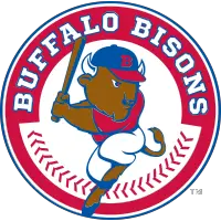
With the start of a new era of Bisons baseball in downtown Buffalo, the team today unveiled an exciting new primary team logo, designed by ADPRO Sports of Buffalo, that will carry the club into the next 25-years at Coca-Cola Field.
After just completing the first quarter-century of baseball at Coca-Cola Field, the Bisons' new team crest represents a modern look to a fan-favorite logo from the first few seasons at the ballpark. The design includes the return of a red-white-blue color scheme as well as a Buster figure gearing up to hit another home run.
"It was important for us to reestablish our own team identity with our new logo. Our fans have continued to express their fondness of the red, white and blue logo from the late '80s and early '90s at the ballpark. We feel this new logo not only pays tribute to that history but gives the team an exciting new look for the future," said Mike Buczkowski, Vice President/General Manager of the Bisons.
New Bisons team apparel including t-shirts, caps, and hooded sweatshirts are now available exclusively at the Batter's Box Gift Shop and online at Bisons.com. The team is expected to unveil their new home, road and alternative jerseys and official on-field cap for the 2013 season in January.
The new Bisons logo will feature scarlet red as its primary color with reflex blue and white accents, giving the club their own unique color scheme. The colors are an updated version of the popular red and navy blue the team used for the first 10 years at Coca-Cola Field. The team has also returned the "hitting Buster" from past logos and updated the script "Bisons" from the 1980s to block lettering. Along with an exciting new logo, the new symmetrical look gives the team great flexibility in marketing and promotional material.
Logo History The new primary logo is the fourth logo for the Bisons since the team began play at Coca-Cola Field. From 1988-1997, the club used a red, white and blue theme with a hitting Buster portrayed on the right side of the word "Bisons" or the letter "B." From 1998-2008, the team used a "sliding Buster" under the word "Bisons" in a green-red-gold color combo. For the past four seasons, the Bisons adopted a blue and orange theme with a more atomically correct bison charging out of the city landscape.
There were minor alterations to the four main logo themes during their years of use.
International League Stories from November 20, 2012
- Bisons Unveil New Team Logo - Buffalo Bisons
- Blue Jays Sign Buffalo-Native INF Jim Negrych to Minor League Contract - Buffalo Bisons
- Bisons Announce 2013 Ticket Prices, Holiday Packs & Cyber Monday Sale - Buffalo Bisons
- Burris, Rende to Round out IronPigs 2013 Staff - Lehigh Valley IronPigs
- BB&T Ballpark Construction Update - Charlotte Knights
- Gwinnett Braves Unveil "Cyber Monday" Deals - Gwinnett Stripers
- Joey Stevenson Repeats as Triple-A Sports Turf Manager of the Year - Indianapolis Indians
The opinions expressed in this release are those of the organization issuing it, and do not necessarily reflect the thoughts or opinions of OurSports Central or its staff.
Other Recent Buffalo Bisons Stories
- Bieber and Kirk Help Lead Bisons to Win
- Bisons Native American Heritage Night June 20 Seneca Niagara
- Costly First Inning Hands Bisons Loss to Syracuse
- Kirk Joins Bisons on Rehab Assignment in Win over Syracuse
- Buffalo Bisons Host Syracuse Mets Prospects, June 9-14