A Deep Dive into Indy's Original Home Team
Published on October 10, 2025 under International League (IL)
Indianapolis Indians News Release
Before looking ahead at the new look of the Indianapolis Indians, maybe we need to look back.
It is 1902. There is no such thing as the World Series. That will be born in 1903 and won by the Boston Americans. Babe Ruth is seven years old, having just been enrolled in a Baltimore boarding school. There are 45 states in the Union, with Oklahoma next on deck. Adam Pintar, the Indians' senior director of brand, marketing and communications, can tick off a view other items: The Wright brothers' first flight is a year away, the Indianapolis Motor Speedway won't be built for seven years, the Titanic won't sink for a decade. The Pacers won't play a game for 65 years, and the Colts won't arrive in Indianapolis for another 82.
But there is a new baseball team in town in 1902 called the Indians. Turns out, they are here to stay.
"I say all these things not to brag about my love of history," Pintar said, a century and then some later. "But my point is that the Indians are our history."
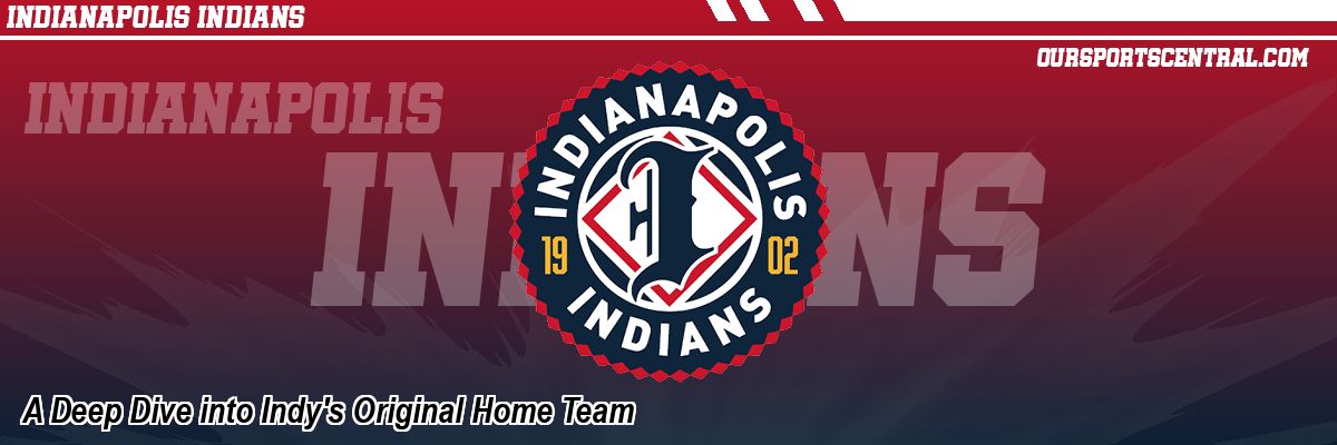
They're old but they're also new, at least their fresh look is, from logo to cap to jersey. And that's the whole idea, 123 years after it all began. That was the mission for Pintar and his creative team the past four years, through countless meetings in the second-floor board room at Victory Field - "Hundreds, and that's just the ones I've been in," Pintar said - and the endless flow of trial and error. Keep this idea, discard that one.
"We're trying to bring in these vintage elements, but we want to do it within a contemporary framework," Pintar said. "So it looks like it could have belonged in the early 20th Century just as much as it looks like it belongs in the 21st Century."
Behold the result, revealed to the world on Sept. 26 at the Indians' annual charity event, SWING presented by Krieg DeVault.
They studied Eastern Woodland Native American patterns and photographs in the quest to find something authentic to tribes in this actual area. You see that in the jersey ribbonwork, among other places.
They looked closely at other organizations with logos that have stood up to time. You see that in the interlocking Indy.
They reached far back to the past for inspiration. The first game between two professional baseball teams was May 4, 1871 when the Fort Wayne Kekiongas defeated the Cleveland Forest Citys 2-0. The style of the I is homage to the blackletter K the Kekiongas used.
They added a dash of modern here, a spoonful of the glory years there. "In all of our research and educating ourselves on the past of the Indianapolis Indians we discovered some cool stuff," Pintar said. "How many people know in 1920 we played and beat Babe Ruth and the New York Yankees? Walked them off at old Washington Park." So the style of the logo on the jersey sleeve is an echo of 1920. There is a whiff of late 20th Century there, too, with a script I beneath Indians, as if it came directly off Razor Shines' cap.
They turned up the creative temperature. Look closely at the Indians wordmark and you'll find Indy discretely slipped in, like the arrow in the FedEx logo.
They pondered over the proper colors. Gold was to be a major component, befitting the gilded age of the early 20th Century. Nice idea, but the staff wasn't crazy about it. Red was a more popular choice - tying the new artwork to every past iteration of Indians baseball - so red is a power hitter in the color palette.
They put up one trial balloon and then another and then a few more. Pintar's computer was full of workshop diagrams. But the oddest thing happened.
"That file is enormous with all these different ideas. But this look was the first idea," he said. He still can remember the day - after months of deliberation and zigging and zagging by the creative team-that he simply mentioned, I think we might already have it. "We had spent so long thinking we were going to find this perfect thing, it was going to be obvious," he says now. "But it wasn't. We ended up going back to where we started, that's where it was."
So refreshing the Indians' look was an exacting journey, from early ideas to the finished product.
"The first thing we had to do as a design team was figure out who we really were, because branding is a lot more than just logos or colors or what the jerseys look like," Pintar said. "It is what you say and how you say it and who you say it to, and what people say about you when you're not in the room."
The creative folks sat down with the senior Indians staff to try to decide just what this franchise stood for. Service, nostalgia, treating people right. That all came through loudly and clearly. They understood any new look had to recognize the importance of history to the aura of the Indians, and the long connection to the city. The fact that the club has been around forever. Almost, anyway.
"That's our biggest differentiating factor. We have been in the market for more than a hundred years and a lot of people don't know that. We are pretty synonymous with the city of Indianapolis," Pintar said. "Indians baseball is a tradition passed down from generation to generation, and it's the memories made off the field that people remember most fondly."
"We like to think that we played a part in setting a foundation for what this great sports town has become."
They yearned for something that would stand the relentless test of time. Jersey styles can come and go, like the width of ties and the length of dresses. That's why they looked so hard at other venerable logos across the landscape of sports. Yep, you, New York Yankees. And you, Green Bay Packers. And others.
"We're always comparing ourselves to big league clubs so we want something that would match that, that would look like it could belong, yes in minor league baseball, but if you sent our logo into major league baseball it looks like it could belong there, too," Pintar said.
They went against a modern branding trend that believes going simpler and plainer is better. That's not always the case. There is nothing simple about the Indians' new look, which incorporates a rainbow of elements.
"I get why they want everything to be very simple and streamlined so it has a lot of different uses over a lot of different mediums," Pintar said of what is currently the popular rebranding style. "But we were very intentional that we do not want to follow this mainstream trend of stripping all the character away from a brand simply because we want it to look perfect across all mediums."
The Indians' history is long and dynamic. "To help tell that story," he said, "we had to look the part."
And they wanted to come up with some new twists that would move the needle in the public. Pintar is hoping the unique interlocking INDY logo and also the INDPLS on jerseys are Victory Field marketing home runs so mighty, they could clear the fence onto Maryland Street. Getting INDY into a logo was a challenge. "There are not a whole lot of four-letter monograms and it is really hard to do," Pintar said "But we think it works well.
"You don't have to be an Indians baseball fan to want that cap. We want to see it all over the city."
So now the handiwork of all the deep thinking, all the research, all the hours, all the work has been getting its first appearance on the public stage. Study what came off this mental assembly line and there is a little bit of everything, from 1902 to 2025, from Native American settlements to the Negro Leagues. The Indians' attire is like a visual trek through parts of two centuries, 13 decades and 22 US presidential administrations. You know how the Indians sometimes wear camouflage uniforms to honor current veterans? In their first game in 1902, there were almost certainly Civil War veterans in the stands. As much as anything, it was the past that drove the present new look.
"All of this was done in-house, which I'm incredibly proud of. This very much was all home-grown," Pintar said. "So much has gone into this and I'm very confident that people are going to receive it well. I've never worked on anything this big. Everybody in Indy knows who the Indians are, everybody recognizes the present logo. To see something that we all played a part in is going to be a very surreal experience.
"A lot of hard stuff is behind us. There's also going to be a lot of hard stuff in front of us but that's the exciting part of it."
International League Stories from October 10, 2025
- A Deep Dive into Indy's Original Home Team - Indianapolis Indians
- Storm Chasers Manager Mike Jirschele Retires - Omaha Storm Chasers
- Banana Ball World Tour to Come to VyStar Ballpark in 2026 - Jacksonville Jumbo Shrimp
The opinions expressed in this release are those of the organization issuing it, and do not necessarily reflect the thoughts or opinions of OurSports Central or its staff.
Other Recent Indianapolis Indians Stories
- Indians Toss One-Hitter in Walk-off Victory, Split Doubleheader
- Storm Chasers vs. Indians May 8 Game Postponed Due to Inclement Weather
- Clippers Use Three Home Runs to Top Indy, 12-0
- Indians Pull off First Walk-Off of the Season over Omaha
- Indians Take Game 2 of Doubleheader against Omaha